
A lot of the personal pieces I work on start out as doodles. I think this is pretty common for a lot of artists, but i thought I’d walk you through, doodle to finish.
A couple weeks ago, on a really unproductive and lazy day, I found this really awesome photograph of an old man who kind of reminded me of a sailer. Trying to salvage some semblance of value in that day, I started doodling this dude, and I really kind of liked where it was going. So i worked out a nice final sketch for it, whittled it down to the basic linework as a skeleton, and transferred it to a piece of Bristol Vellum. The plan was originally to ink it, actually, but I have all these pastels and colored pencils laying around, and well… it became play time.

So after transferring the sketch, I started by laying down some pretty basic colors. On some of the darker areas such as the jacket, I laid down some pan pastels, but for the most part I alternated layering cooler colors for my shadows, and warming them up in my midtones and highlights. I didn’t want to use any purely “black” colored pencil because it tends to dull the colors out, so for my shadows I would either “mix” my own black or use a dark violet, brown, or blues depending on how cool i wanted to pull the temperature.

After a while, the skin tones really started to come together. I didn’t want a whole lot of really drastic dark shadows in this area, so it was actually rather easy to blend. I simply layered the colors on top of each other until it was the color I wanted. A lot of the time I actually used a white, pink, light orange, or tan colored pencil to really blend the waxy material together. I didn’t want a whole lot of the texture of the paper to show through, and this is why I used the Bristol Vellum. Its smooth, and a lot easier to control the texture. By putting a lot of pressure and using those lighter colors to blend, it’s easier to get a nice solid surface without any gaps in the pencil.

Here I was just starting to add in some of the darker areas. I opted away from doing much facial stubble because it didn’t quite fit the rest of the face. To do the really dark shadows at the base of the chin and behind the ear, I actually applied a light layer of a dark blue pan pastel first, and built up violets and blues on top of it along with some pinks to keep the skin tone somewhat even. I’ve actually since found that using a small underpainting of watercolor actually works a whole lot better than pan pastels in doing something like this. That being said, pan pastel works great as well if you can avoid going too heavy with it. There’s a threshold you cross with pan pastels and color pencil that makes it very difficult to layer on top of.

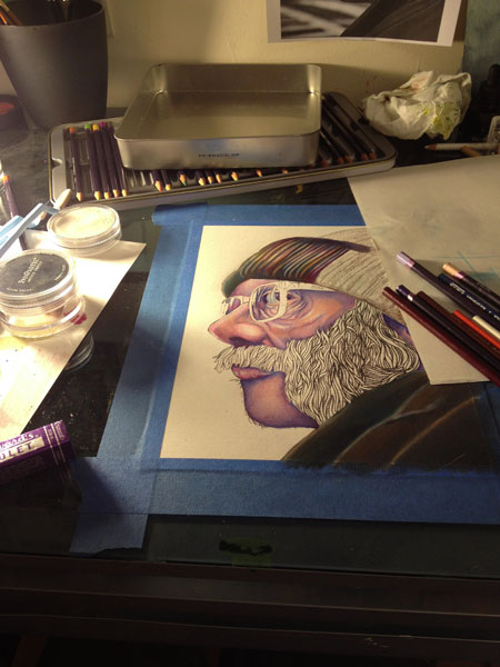
The jacket in the front is a great example of using too much of the pan pastels. I caked it on too thick to try and get a nice dark undertone, and unfortunately that makes it harder for the waxy colored pencils to “sit” on top of the page. Luckily, I just wanted this area to be pretty dark, so it isn’t too huge an issue. I also added some of the beanie in the same fashion as everywhere else: layers and layers of colored pencils and probable development of carpal tunnel syndrome. From here, I’ll be going back in to the shadows around the ear to darken it and match the skin tone a bit more evenly, and simply finish the beanie. I’ll also be adding a light tone for the background to separate the beard and glasses, and make them pop out a bit more.

Heres the final piece!
-J